Experiential marketing is having a moment—again. As audiences tire of generic ads and increasingly curate their attention, brands are leaning into live touchpoints: pop-ups, conferences, product roadshows, in-store activations, and community events. The goal is simple to say and harder to execute: create a memorable interaction that people feel, not just see.
In that context, roller banners can sound almost too humble. They’re not the flashiest element in the room. Yet they routinely determine whether an activation feels cohesive or chaotic, premium or improvised. Used well, they become part of the experience itself—quietly guiding attention, shaping flow, and making key messages land.
Why “small” physical touchpoints still matter in big experiences
A good experience has a narrative arc. People need to know where to go, what to do, and why it matters—within seconds. Roller banners support that arc in ways that screens and staff alone often can’t.
They reduce friction at the point of entry
The first 10–15 seconds of an event interaction are crucial. If visitors can’t quickly answer “What is this?” and “What should I do next?”, they’ll drift. A well-placed banner at the edge of your footprint can do the job of a greeter when your team is busy.
Think of it as wayfinding for attention: a headline that frames the moment, a short benefit statement, and a clear next action (“Scan to try the demo”, “Join the workshop at 2pm”, “Vote for your favourite feature”).
They reinforce brand cues without hijacking the room
Experiential marketing works best when the environment feels intentional. Roller banners help create that consistency—color, typography, tone of voice—without turning the activation into a wall of signage. They’re also easy to reposition as the space fills up or the queue line shifts.
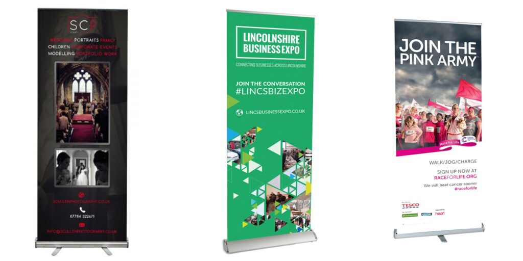
Roller banners as “experience infrastructure,” not just signage
The teams that get the most from roller banners treat them as modular infrastructure. Not decoration. Not an afterthought. They design banners to support specific moments in the visitor journey: attract, orient, engage, convert, and follow up.
Attract: earn the first glance
In crowded venues, you’re competing with movement, noise, and other brands. Your banner’s job isn’t to explain everything. It’s to win a second look.
A practical rule: one idea per banner. If you try to cram in features, paragraphs, and five calls-to-action, you’ve built a poster, not a lure. Aim for a punchy headline, a supporting line, and a visual that reads from 3–5 metres away.
Orient: make the experience self-explanatory
Once someone steps closer, clarity matters more than cleverness. Your banner can do the heavy lifting here—especially at conferences where your team is managing demos, conversations, and lead capture simultaneously.
This is also where having flexible pop-up display options can make a difference, because roller banners work best as part of a broader, adaptable setup rather than as standalone items. When you can adjust your display mix to the venue—narrow booth, open floor, retail corner—you can keep the experience consistent without forcing a one-size-fits-all layout.
Engage: guide behaviour, not just awareness
Experiential marketing isn’t passive. You’re inviting people to do something: test a product, join a mini-session, scan a QR code, smell a sample, or share content.
A banner can act like a “silent facilitator” by spelling out simple steps:
- What happens here
- How long it takes
- What you get at the end
That last piece is often overlooked. Even in a B2B environment, people respond to clear value. “2-minute assessment → instant results” is a stronger behavioural prompt than “Learn more about our solution.”
Designing roller banners for real-world environments
A roller banner that looks great on a designer’s monitor can struggle on a busy show floor. Lighting, viewing angles, and the speed at which people walk past all change the game.
Prioritise legibility over aesthetics
Legibility is not a creative constraint—it’s what makes creative work effective.
A few practical choices help:
- Use high contrast between text and background
- Keep body text minimal; favour short phrases
- Place the key message in the top third (it’s least likely to be blocked by people standing nearby)
- Avoid thin fonts or overly subtle gradients in low-light venues
Build for photos (without designing only for photos)
A lot of experiential ROI now includes “shareability”: attendees posting images, partners snapping booth photos, staff capturing highlights for LinkedIn. Roller banners often end up in those frames, whether you planned for it or not.
Make sure your URL or campaign name is clean and readable. If you’re using a QR code, test it from a phone held at a natural angle—not perfectly square-on. And consider whether your tagline makes sense out of context; photos travel faster than explanations.
Match message to moment
If you’re running a multi-day event, rotate banners by daypart or audience segment. The message that works for morning keynotes (“Book a demo”) may not suit late afternoon traffic (“Grab the checklist” or “Join the 4pm teardown”).
This is one of the underrated strengths of roller banners: swapping creative is easier than rebuilding a set.
How to use roller banners strategically across the attendee journey
A roller banner can do more than announce your brand. It can support measurement and follow-up, too—two areas where experiential teams often struggle.
Pre-engagement: set expectations
If your experience includes a wait (popular demos, giveaways, limited seats), use a banner to set expectations and reduce frustration: “Next session starts in 7 minutes” or “Scan now to save your place.”
During engagement: keep the promise visible
If your activation is built around one “big idea,” keep it visible while people interact. This is especially useful when staff rotate in and out. The banner acts as a steady anchor for the narrative.
Post-engagement: convert attention into a next step
A subtle but effective tactic is to place a “next step” banner near the exit path of your space. People rarely want to stop the flow at the entry, but they’ll often scan or read on the way out—especially if they’ve just had a good interaction.
The bottom line: roller banners are quiet, but they’re not minor
The best experiential marketing feels effortless to the attendee. Behind that ease is a lot of intentional structure—messaging, pacing, and spatial design that guides people without barking instructions.
Roller banners sit right in that sweet spot. They’re portable, adaptable, and—when designed with the visitor journey in mind—surprisingly powerful. Treat them as part of your experience architecture, not a last-minute print job, and they’ll repay you with clearer engagement, smoother flow, and a stronger brand impression that holds up long after the event lights go down.