Your last sprint review went fine — the team delivered, the demo went well, and everyone moved on. But when planning the next sprint, the same question came up again: how much should we commit to? Someone said, “The same as last time.” Someone else said, “A bit more.” Nobody really knew. That guesswork is exactly what the Jira velocity chart is designed to replace.
What Is a Velocity Chart?
A velocity chart shows how much work a team completes sprint to sprint. Instead of asking “are we on track right now?” — that’s the burndown chart’s job — it asks a different question: “based on how we’ve been performing, how much can we realistically deliver next time?”
In practice, the chart plots completed work as bars across past sprints, typically measured in story points. The pattern that emerges becomes the foundation for smarter sprint planning — not gut feeling, not optimism, but actual delivery history.
What Jira’s native velocity chart does well — and where it stops
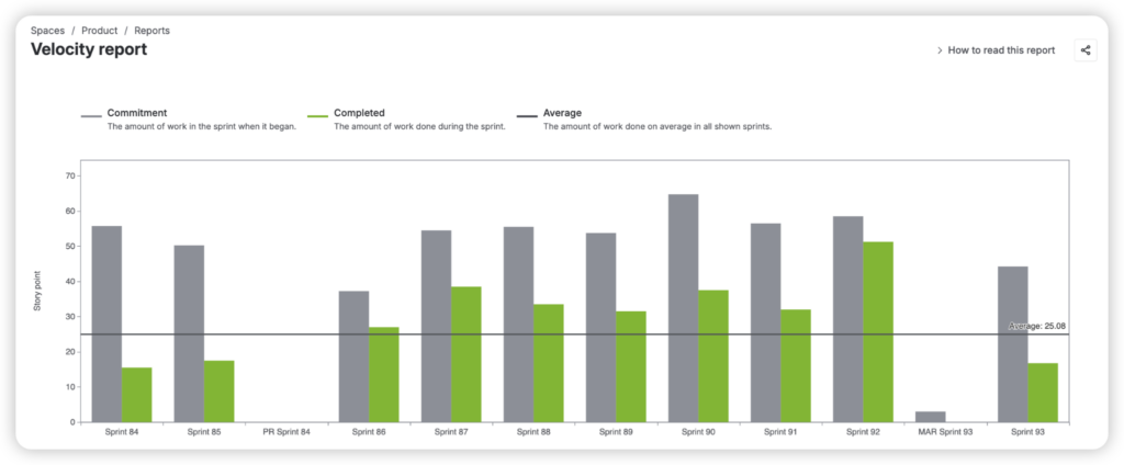
Jira includes a built-in velocity chart in the Reports section of every Scrum board. It shows two bars per sprint: what the team committed to, and what they actually completed. For a team just starting to track performance, that comparison is genuinely useful.
But the native chart only tells part of the story.
It lives inside the board’s Reports section and can’t be added to a Jira dashboard, so it’s invisible unless someone specifically navigates to it. It’s limited to a single board, meaning there’s no way to compare or aggregate performance across multiple teams. And it tracks only two data points — commitment and completion — without any visibility into what happened in between: scope added mid-sprint, work that rolled over, issues that were removed, or estimates that changed.
For teams that want to understand why their velocity looks the way it does, the native chart quickly runs out of answers.
What a more complete velocity view looks like
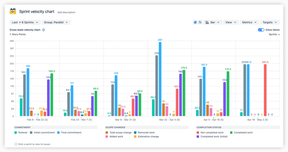
This is where the Sprint Velocity Chart by Broken Build extends the picture considerably.
Key jobs-to-be-done:
- Track sprint planning accuracy and identify consistent over- or under-commitment patterns
- Monitor scope changes that impact sprint goals and team predictability
- Compare scrum team velocity across multiple teams for program-level visibility
- Set performance targets and measure sprint outcomes against capacity expectations
- Uncover hidden inefficiencies through detailed breakdowns and issue-level analysis
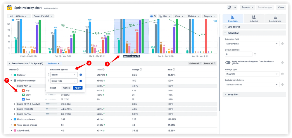
Rather than two bars per sprint, it surfaces up to 10 metrics — including rollover, scope change, added work, removed work, estimation changes, and unfinished tasks — giving teams a full account of how each sprint actually unfolded from planning to close.
A few features stand out in practice:
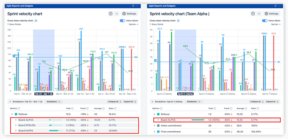
Multi-team aggregation lets you build a single velocity view spanning several boards and teams — essential for anyone managing delivery at a program level rather than a single squad.
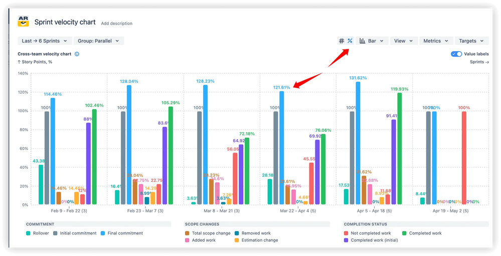
Percentage-based (relative) view normalizes results across sprints of different sizes, making them directly comparable. The say/do ratio — the percentage of committed work actually delivered — becomes an honest, sprint-by-sprint measure of planning reliability.
Moving average trend line smooths out one-off anomalies to show whether your team’s output is genuinely growing, declining, or holding steady. It’s the difference between reacting to individual sprint noise and understanding the real trajectory.
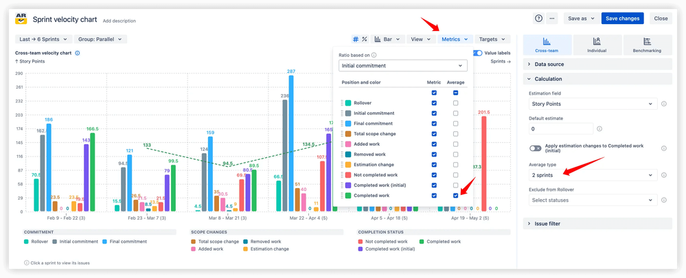
Breakdown by issue type, assignee, or custom field lets teams pinpoint what’s actually driving velocity fluctuations — whether it’s a category of work that consistently overruns, or scope additions that quietly inflate every sprint.
Your team’s performance has more to say
Velocity isn’t about celebrating high story point totals. It’s about building the kind of predictability that makes sprint planning honest, release commitments credible, and retrospectives useful. The right chart doesn’t just show you the numbers — it shows you what’s behind them.
Start by opening your velocity data at the next sprint planning session. Let history inform the conversation. And when you’re ready to see the full picture, explore the Jira velocity chart by Broken Build to find out what your team’s performance has really been telling you.